Lets face it, your website wasn’t created just to look pretty. Your website should be driving you traffic and most importantly sales! So what are you lacking that is hold your site back from driving you sales?
- You Didn’t Do Surveys
It can be said that if you are not doing surveys to find out why people buy your product and what “buttons” make them buy, then your marketing is really a complete guessing game and the odds aren’t always in your favor. Therefore surveys are the MOST important part of any marketing and promotional campaign.
- Lack of Targeted Traffic
Without people visiting your site no one will see you – that’s obvious. But it should also be just as obvious that the traffic you are getting should be your ideal customers. It does no good to have all the traffic in the world if they’re not the people that buy your product or at least visitors who will spread word of mouth about you. This is where SEO comes in. We find out what your ideal customers are searching for and optimize your website so those people who search for that end up on your site.
- Poor or No “Button” and Call-To-Action
If you’ve done surveys you will find out what are the “buttons” (figuratively) or words you can use to bring about an emotional response in your ideal customers and create a desire in them to purchase your product/service. You must use this button/words on your website. It should be the main focus of your site and certainly the main part of your home page. After your button, you need to have some sort of call-to-action. With the button you got their attention. Now that you have their attention you need to get them to do something, wich is what your call-to-action does. Most cases it’s contact you, but that could be different. - No Easy Way to Buy
Look at your website, can a visitor EASILY contact you to purchase without having to look around your site to find your phone number or an email, contact form checkout page? Ideally this should stand out and be part of your call-to-action. Let’s say your selling widgets. Are you listing each of the available widgets on your site so someone can easily find them and then simply click a link, fill in a form or give you a call to purchase? Put your self in your customer’s shoes and then look at your site. Make your site function based on the response you want from your customers.
- You don’t A/B Test
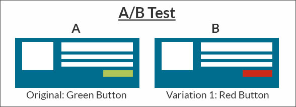
I could have correctly made reason #5 poor design or bad content/text or something to that effect, but the fact is if you don’t survey (and yes an A/B Test is a type of survey) you won’t know if something should be changed or what changes make a positive or negative effect on your site. You should be A/B testing to find out what works and what doesn’t. Google tested 41 shades of blue just for their search button to find out which preformed best. It’s just as critical for you to be testing pieces of your website. FYI, just in case you don’t know what A/B testing is, it’s a simple way to test changes to a web page against the current design and determine which ones produce positive results.


